This article was translated into English by Artificial Intelligence. You can read the original version in 🇮🇹 here.
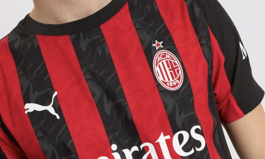
"The Devil is in the details" reads the slogan accompanying the launch of Milan's new home kit for the 2025/26 season, and so it is.
The club does not abandon tradition, keeping the regular red and black stripes, but there are certainly some new features. And one in particular has sparked reactions on social media in recent weeks.
The main novelty of Milan's new skin concerns the monochrome logo: the symbol abandons the classic red and black colors and is presented in a new look characterized by a red background and white lines.
THE DEVIL IS IN THE DETAILS 🔴😈⚫️
Introducing the 25/26 #ACMilan x @pumafootball Home Kit. Available now.
#SempreMilanpic.twitter.com/PksbJ0OJgX— AC Milan (@acmilan) May 22, 2025
This is a detail already seen on the second and third kits, but never on the first kit, and it is precisely this that has made many fans raise their eyebrows.
Apart from this particularity, the clean look remains: the black sleeves and collar characterize a shirt that embraces tradition in the club's colors and symbol. Between the lines, the reference to the kits of the 1980s is indeed evident.
KIT AWAY AC MILAN 25/26
ESPERO QUE OS GUSTE Y LO DISFRUTEIS#kitmaker#peskits#PS5#eFootball2025#PES2021#acmilan#Milan#seriepic.twitter.com/w9OMPmO3Wi— Melguizo (@melguizo96_) April 9, 2025
Gray flames characterize the classic black and form the figure of the famous Little Devil. An interesting detail that will most likely be present as a logo on next season's away shirt.
For the first official appearance, there’s not long to wait: as every year, Milan’s new home kit will make its debut at San Siro in the last match of the season against Monza.
#Milan #reveal #home #kit #logo #Devil #details


